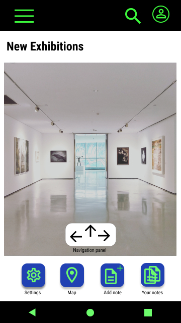
A virtual tour app for an art gallery.
Smart Art TIT is a company that brings together four art galleries in the city of Titulo, which is famous for several schools of art. As the galleries are not open every day of the week, they offer a virtual tour of 4 different locations and four different kinds of art, in addition to the traditional tour. They would like to attract people from different parts of the country and promote local artists. Smart Art TIT focuses on young people who are interested in art and like to use technology to view it.


Project overview
Problem
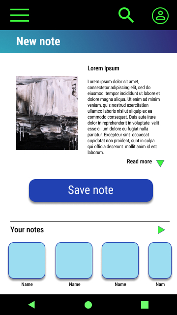
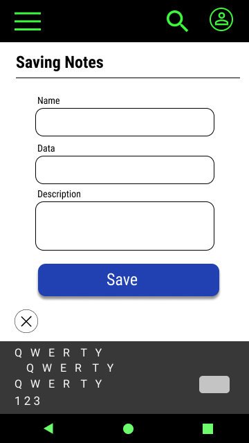
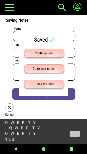
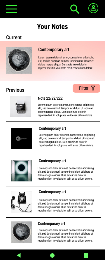
Busy students need a quick and easy way to make notes as they explore the gallery. They want to be able to save their notes for future use.
Goal
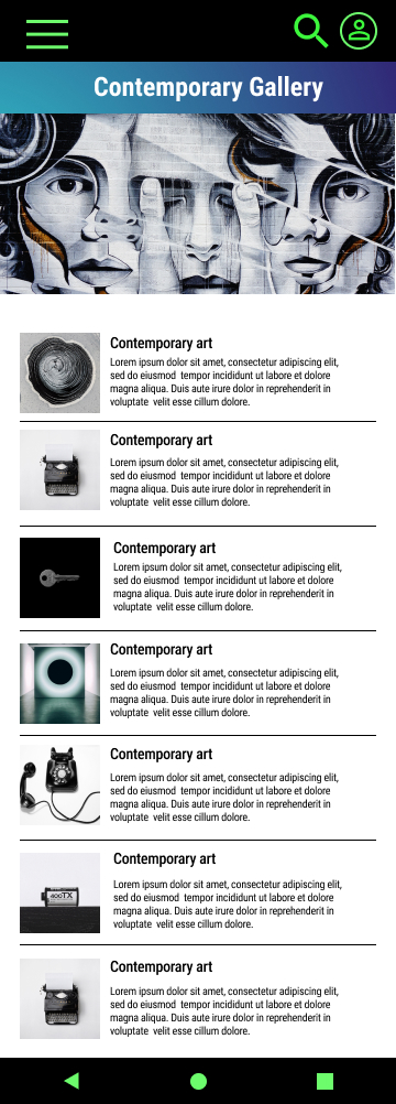
Design an app for Smart Art TIT that allows users to easily make, save and share the notes about the art they explore during virtual tours.
Role
UX designer – designing an app for Smart Art TIT from conception to delivery.
Responsibilities
Conducting interviews, user research, wireframing, low and high fidelity prototyping, conducting usability studies.
User research: summary
I conducted interviews and created empathy maps to understand users’ needs. A primary group identified through my research was busy students who don’t have time to make good notes, and easily collect and save them for use in the future in an organised way. This user group confirmed initial assumptions about Smart Art TIT visitors, but research has also identified different fields that could be improved to meet customers’ needs. Other user problems included indecisiveness and not being able to make a specific selection in the exhibition. They needed more options to make a specific selection.
User research: pain points
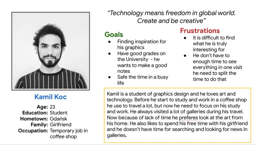
Persona: Kamil
Problem statement:
Kamil is a graphic design student, who wants to make high quality notes quickly and easily in order to improve his knowledge about art and attain good grades in his university course.
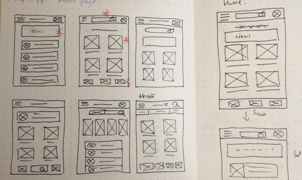
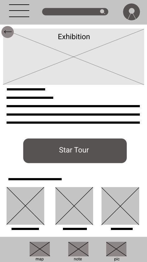
Paper wireframes
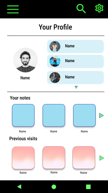
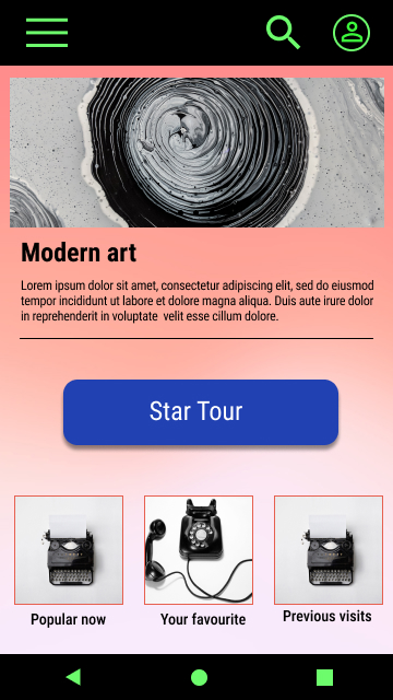
Taking the time to draft iterations of each screen of the application on paper ensured that the elements that made it to digital wireframes would be well-suited to address user’s pain points. For the home screen, I prioritized an explore and search option as well an easy access to profile.
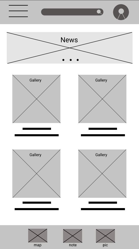
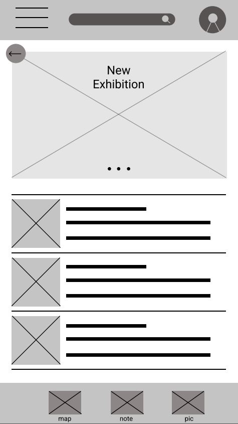
Low-fidelity prototype
As the initial design phase continued, I made sure to base the main screen design on feedback and findings from the user research.
Usability study: findings
Mockups


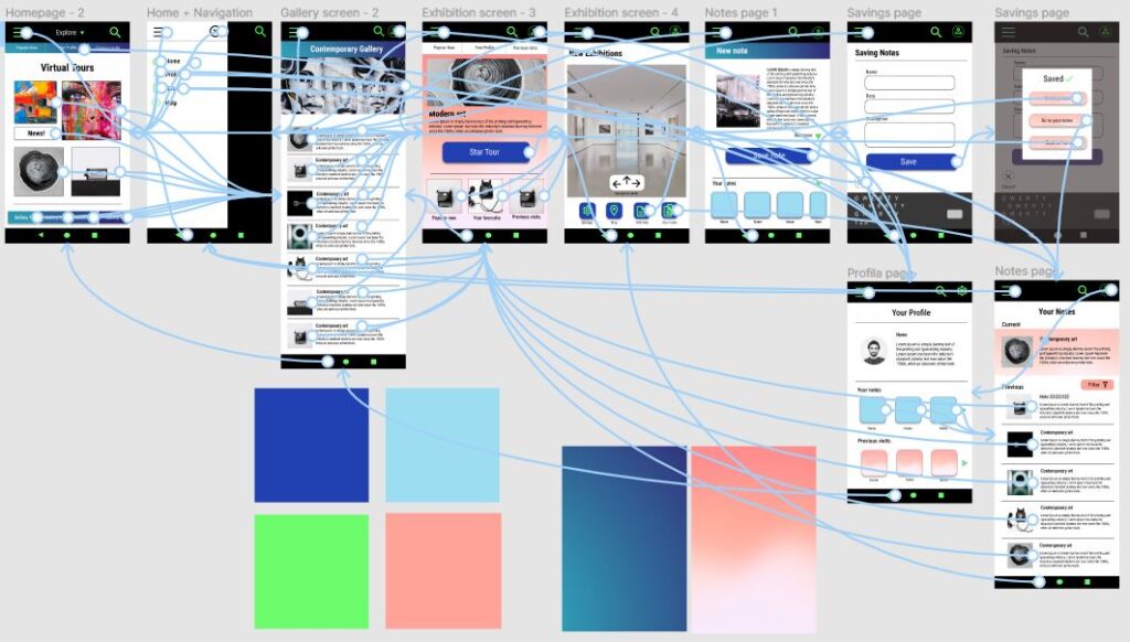
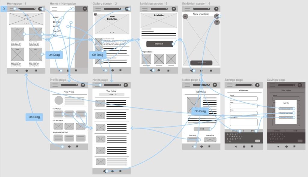
High-fidelity prototype
To create a high-fidelity prototype I connected all of the screens involved in the primary user flow of making notes during a virtual tour in an art gallery.