Design a shopping list making flow for a culinary blog
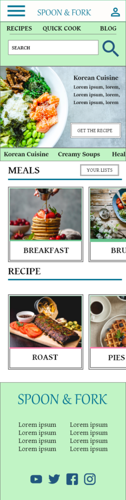
Spoon & Fork is a culinary blog promoting healthy food and trendy recipes. The typical user is 26-45 years old and most users are women who like experimenting in the kitchen. Their goal is to help users make healthy and delicious meals by enabling them to compile a shopping list with ingredients from the recipes.
Project overview
Problem
Users need an easy way to make a quick list of the ingredients from the culinary blog recipes.
Goal
Design useful features and options to help users save a shopping list of ingredients online to make their shopping much easier.
Role
UX designer – designing a website for Spoon & Fork from conception to delivery.
Responsibilities
Conducting interviews, user research, wireframing, low and high fidelity prototyping, conducting usability studies.
User research: summary
I conducted interviews and created empathy maps to understands user’s needs. A primary group identified through my research was women who love cooking and often read culinary blogs looking for healthy and trendy recipes. They would like to have an option to save a list of ingredients from the recipes. Others user needs included ability to choose a large variety of dishes from around the world.
User research: pain points
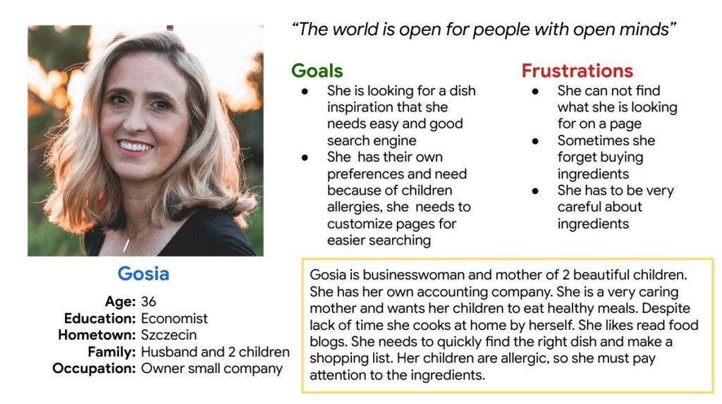
Persona: Gosia
Problem statement:
Gosia is a busy working mom who wants to make healthy meals for her family. She wants to make an accurate and complete shopping list because she doesn’t have time to visit the store twice a week.
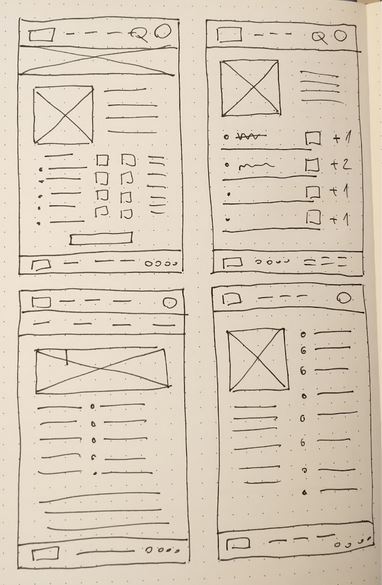
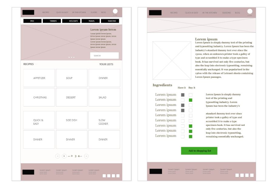
Paper wireframes
I did a quick ideation exercise to come up with ideas for how to address gaps identified in the competitive audit.
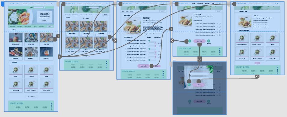
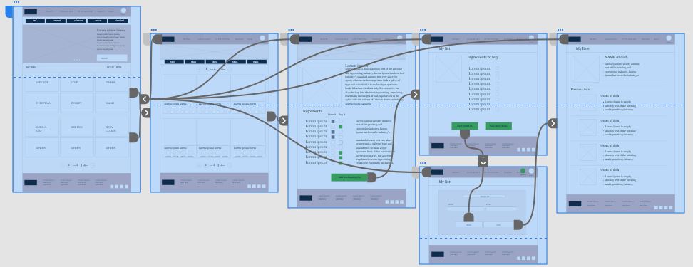
Low-fidelity prototype
I created a low-fidelity prototype, I connected all of the screens involved in the user flow of finding a recipe and adding the ingredients to the shopping list. I prioritized location of useful buttons and easy access to quick options.
Usability study: findings
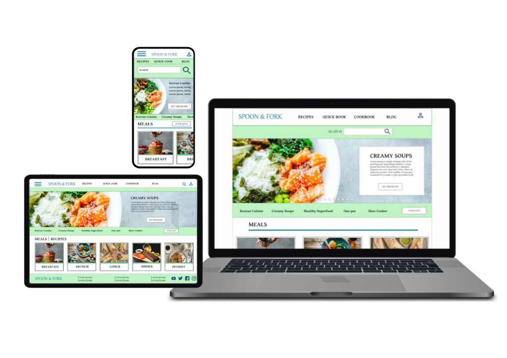
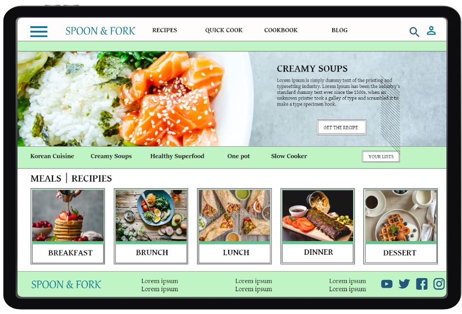
Mockups
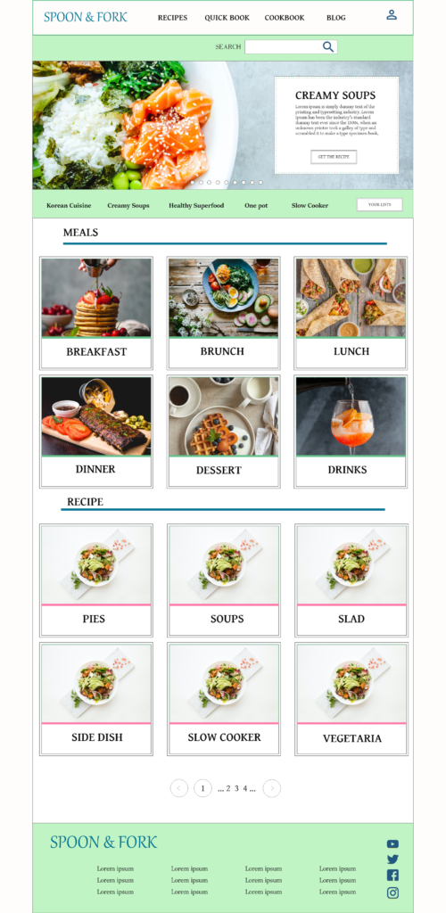
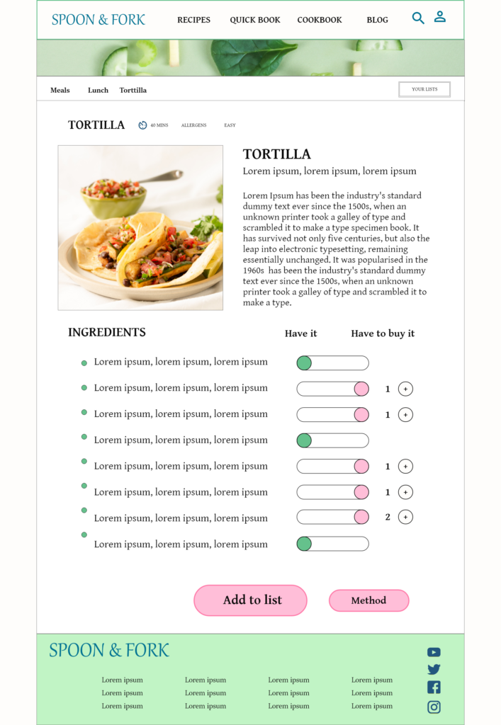
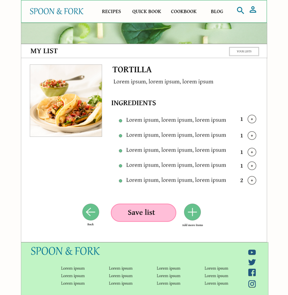
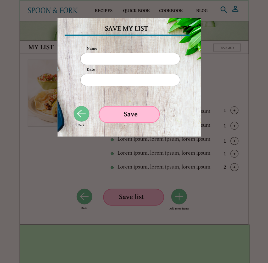
High-fidelity prototype
To create a high-fidelity prototype I connected all of the screens involved in the primary user flow. I included design changes made after the usability study.